Site Launch Scheduled for 8/29: NMDP.org
NMDP is the nation’s manager of the blood stem cell donor registry. They focus on recruiting and registering donors and facilitating transplants for those with blood cancers and disorders. This site is to be retooled to help recruit donors and support patients through the transplant journey.
PROBLEM
The current site has not been updated despite the organization having undergone two separate rebrands. Different org teams have differing levels of buy-in, resulting in outdated information.
SOLUTION
To interview users on issues they experience while using the site, to create a clear user flow, remove irrelevant landing pages and to establish a strong, new brand identity.
TOOLS
- Miro
- Figma
- Jira
TEAM
- 1 UX designer
- 4 strategists
- 4 directors
- 8 developers
- 3 project managers
- 1 SEO specialist
- 2 graphic designers
- 15 SMEs
MY ROLE
- Content designer
- UX writer
- Workshop facilitator
TIMELINE
- Overall: 16+ weeks
- Discovery & Research: 8+ weeks
- Design & testing: 8 weeks
My Design Process
Content Audit

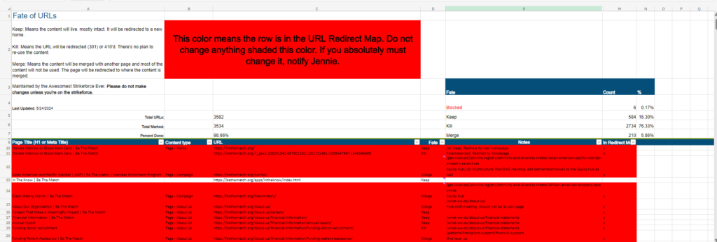
Due to the site continually receiving new webpages and redirects to microsites without the removal of old copy, we determined to audit the content to retire, consolidate, or keep ages and review the determinations with SMEs.
Interviews
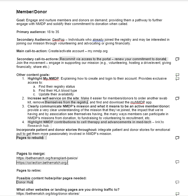
Having made content determinations, The content strategist and I opted to build content strategy one-pagers to review goals, audience, and page determinations to expedite the interview process. This allowed us to work through all SME interviews in just a few weeks and retire 76% of the content.

Personas
We wanted to make sure that the goals of the website reflected the different users and not just our business goals. We identified the personas as college-aged donors, patients diagnosed with a recent disease, casual observers of the organization (gen pop), and long-time fans and volunteers of NMDP. This resulted in us noticing a few issues with the content:
-Our patient-facing content was cold and unsympathetic
-Our donor-facing content was overwhelming and congested
-Our volunteer-facing content was underdeveloped and vague
User Journey
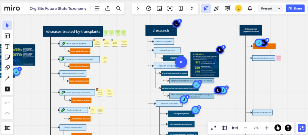
With the business goals and personas in mind, we made sure perspective donors were informed and directed through a clear content path to understand what donating entails. Patients were able to quickly access resources and volunteers had exciting, engaging opportunities presented.

Two problems were the need for content explaining our legislative advocacy volunteer opportunities and content that engaged with minority groups interested in donating. We opted to build out content for the legislative work and integrate content promoting inclusivity throughout the site.
Copy Design
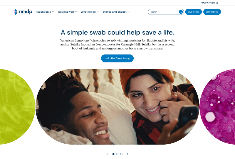
We began the process by having several page templates developed with new brand components. I advocated for a design that promoted a content-first approach while keeping in mind content length and a focus on design.

The result was using pill-shaped carousels that displayed a combination of images and text. Images that highlighted human engagement and connection was the focus, emphasizing the brand identity of connecting donors and patients for the sake of a cure.
Lucas has been incredibly helpful in giving the project team context and guidance (and decision making)
Nicholas Howison, Manager of Marketing Automation at NMDP